For these, in Lightroom, I took the saturation down to -48 or so, upped the color temperature a bit (warmer), and played with the saturation of the oranges, yellows and reds to find the right mix of desaturation and warmth.
In this one, I heavily re-saturated the blue and yellow tones to emphasize Barry Hannah's tome -- Airships. I thought that that, paired with the shallow DOF on his name, might make it stand out, maybe as a kind of ode.
Here's the image:

I rather liked the way it turned out. The only thing I'm not sure about is if it looks too dark.
I tried another one with my husband's amp. It sits in our incredibly 70s-ish hallway (thanks to the wallpaper, among other things), so I also gave it some fairly heavy vignetting in post-processing to try to convey that vintage feel. Again, I'm not sure if it looks too dark:
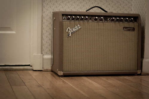
I could probably have stood to brighten it a bit. Maybe I'll try that and repost later.
Otherwise, I like the results.
I am also curious to try out this treatment with photos that were taken outside on bright, sunny days. If our weather keeps on as it's been going, though, I might have to wait a while for a chance at that!

No comments:
Post a Comment