Sunday, April 25, 2010

First Canon L: 135mm

Well, the 135L was delivered Friday, but when I got home, I had no one to shoot! My husband was off celebrating a friend's birthday, so I was left to my own devices to test out the new glass. I took a walk around the neighborhood and took some photos of squirrels and people taking their dogs for walks, but none of that was interesting. So yesterday, we had some friends over, and I got the chance to shoot people (hooray!).


My friend M. exercising my XT:


And okay, so this last one isn't a person, but whatever :)


There's some funky resizing stuff that's making the photos look not-as-awesome as they look on my computer -- I really need to learn how to "resize for the web." Should probably put that next on the to-do list.

I like the lens a lot. More chances this weekend to get some yummy portraits.

Wednesday, April 21, 2010

the elusive histogram | the photographer's life cycle

You know the one I mean. If your photo has failed, all the pretty colors are jammed up against the left side. If it's succeeded, things are a little more spread out, and usually further toward the right.

I've heard the slogan: Expose to the right!

I wasn't really sure what that meant when I first heard it. I then proceeded to learn the basics (blown highlights, too-dark shadows, dynamic range, &c.), but I still didn't really understand the histogram and what it was telling me.

Well, someone I follow on Twitter recently posted this link, and the article (and related articles) is an extremely helpful explanation of the histogram in Lightroom specifically (and the Tone Curve), which is awesome, because I use LR. I am probably going to reread this article, specifically when I edit my next batch of photos, whenever that might be. (I could re-edit old ones and give the knowledge a go tonight, but I am too tired for this.)

I am not too tired, however, to also share this with you, from this site:


I know it's hard to read, but one of the funniest parts is at the beginning of the blue line, where you think you're awesome because your flower photos and cat photos turn out well. Been there! (Though in my defense I didn't think I was awesome, I just thought I had taken a couple of pretty good photos. Sigh.)

I don't plan on falling into "the HDR hole," but maybe that's because I don't have a tripod yet ;)

"Gearfaggotry" is an interesting stop along the way, too, haha. I have also definitely been there. Actually still climbing out of that hole, though I've stopped obsessively reading forums about lenses.

Otherwise, I'm not sure where I fall on this chart. But wherever I am, I suppose I can look forward to that long fall down the blue line to "Dammit, I suck." One step at a time ;)

Sunday, April 18, 2010

illadelph street photos

Our day and a half in Philadelphia went by quickly, but we saw a lot! I actually fell in love with the city -- full of stylish people, interesting & colorful streets, very neat attractions, and lots of charm, culture, and personality!

Here are some of my favorite shots. First we had breakfast in Reading Terminal Market. This was taken with my 50mm:

The man had some nice jams :) Also with the 50:


Here are two from Rittenhouse Square. Both were taken with my 85mm:


Of course, we toured Independence Hall (with the 50mm):


And there are a lot more, but I suppose these really are my favorites.

I was actually really pleased with how most of my photos turned out. Often when traveling, I am sometimes rushed, or anxious, or flustered, and I forget about some important settings, or don't bother to check the photos to make sure they turned out. Of course I had some of those this time, too, but most turned out as I expected them to. I consider that a win! and an improvement.

I was excited to explore a new city with my (still) new 5D. I do see a quality difference in the photos (compared to those taken with my 350D), and also a sort of "atmospheric" difference -- especially in the shot of the man in the market (first shot above) and the one of the guitar player in Rittenhouse Square. I am still very pleased with the performance of this camera. And actually, I didn't get that tired carrying around the extra-heavy cam all day on Saturday. I'm still really glad I made the decision to get the used 5D.

One interesting thing I noticed is this: I think I'd get more out of a 24mm than a 35mm -- I noticed when walking around the city (with tall buildings, narrow streets, &c.), and inside restaurants or other small shops, that I almost constantly needed a much wider angle. That is actually a good thing, because now maybe I'll move the 24L up on my wish list, ahead of the 35mm. I am kind of waiting for Canon to update the 35mm anyway, so it's not a bad thing. It is not so good, though, that the 24L is still $1700! I'll likely still be holding off on that purchase for a while.

A fun weekend!

Wednesday, April 14, 2010

Case Study: B&W vs. Color

This is one from the middle of March -- one of the first few nice days of spring we saw. It was taken with my 85mm:


When I first edited this image, I left it in color, which looks like this:

I like the image okay in color, but I think a black & white treatment unifies the four kids and makes the image look more cohesive. I also think it makes it look more timeless. Fortunately, three out of the four kids are wearing lots of white/light colors, so they stand out even with the b&w conversion, which is nice.

Bummers in general:
1. It's a bummer that the boy on the left is behind the bar.
2. It's a bummer that there are such harsh shadows.
3. It's a bummer that I shot it at f/4 instead of f/8, or something more appropriate.

One last note -- I cropped the image to 16:9, which I think works really well for this composition.
I think the two trees framing the scene are nice, too.

Tuesday, April 13, 2010

Flowers in great light

Here are few from a couple of weeks back. Spring had just sprung, and I was practically worshiping the sun and the budding flowers...


I like the first one of yellow flowers better; they're facing the viewer, so it's a more welcoming shot. The isolation of this one by itself is nice, though.


This was late-afternoon, and I almost couldn't believe the light, especially on that last one. It looks artificial! I should frame that one instead of the white flowers against blue sky from my post the other day! The one thing I don't like about the third one is my focal point. I wish I'd focused on the top-most part of the flowers. Bummer. But still, it's such a moody shot for a flower picture. I like it.

We're going on a mini-trip to Philadelphia this weekend (a day trip, really), so I'm excited about what I might find there!

Friday, April 9, 2010

Using natural light

A couple of posts ago I promised to find some photographers who shot exclusively with natural light. Well, not only did I find a few, but I also found some good tips on how to use natural light effectively for portraits.

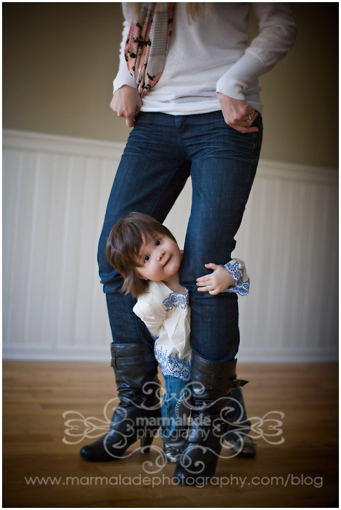
I found Marmalade Photography, and they prove you can do a lot with natural light:


I also found Lauri Baker organic imagery, who does some fabulous black and whites.

I found Audrey Woulard, who can do some amazing things with light! Proof:


And then I found Beth Lofgren Photography, where Beth from Tennessee captures very natural-looking (and naturally lit!) scenes... and gracefully! See:

I am encouraged.

I think I can get away with this if I learn to always stay very aware of where the light is coming from, and how much is coming from where. I also wouldn't be opposed to acquiring (or creating home-made) a couple of reflectors to take along every once in a while.

It also seems to be all about placing your subject in the ideal location -- which isn't always possible, especially with candids, but it's something to think about when choosing my own seat at an event, or when wandering around, wondering where to stand. Stand in the place where the light will work for you and for your photos!

I see lots and lots of practice in my future!

Note: No photos in this post are mine; see corresponding links!

Frame 'em!

I think I might print these up to frame and hang them as a series in the bedroom. I dream of one day having white, country-French bedroom furniture. I would love these photos in a room like that.


Now the question is: What color frame? (Or, a frameless frame?)